


A delayed Jira issue rarely explains itself.
It might be blocked. It might be waiting for review. It might have bounced from testing back to development twice. It might be perfectly normal for its issue type and project, just longer than the team expected in standup.
The hard part is that those are different conversations. "This ticket is aging" is not the same as "this ticket is risky." "This issue was reopened" is not the same as "this issue spent most of its time waiting." But in native Jira, teams often have to reconstruct that story from fragments: issue fields, board status, Activity history, JQL, and separate reports.
Native Jira gives teams pieces of that evidence. The Activity section can show what happened on a work item, and Jira Query Language can find issues where status changed in a specific way. Those options are useful, but they still leave the reader with a second job: opening the issue and interpreting the movement. Teams can build automation counters or search for status changes, but they still need a simple way to see which issues are problematic and why.
That is the gap Agile Cycle Time Chart 2.4.0 is designed to close. It brings issue health and status transition history into the Jira issue view, so the team can move from "this feels stuck" to "this is the exact timing and movement behind it" without leaving the ticket.


Spot risky Jira issues before the retro and trace status movement from the ticket view with Agile Cycle Time Chart
Why issue-level flow signals matter
Flow metrics are useful because they describe how work actually moves. Scrum.org describes Work Item Age as a complement to cycle time: cycle time is about completed work, while age helps teams reason about work that is still in progress. ProKanban's basic flow metrics make the same distinction: WIP, cycle time, work item age, and throughput answer different questions.
That distinction matters in Jira.
Cycle time tells you how long completed work took. Lead time tells you the full wait from creation to done. Work item age tells you how long active work has been in progress. Time in status tells you where the time accumulated. Status history tells you whether the issue moved cleanly or bounced through the workflow.
Most of those signals are lagging indicators. Cycle time, lead time, and time in status are strongest when the team is explaining what already happened. That is valuable for retrospectives, but it is late for daily action. Work item health changes the timing: it turns the current issue into an immediate signal, so the team can act while the ticket is still moving.
Most teams need all of that, but not always in a dashboard. The most common operational moment is smaller: someone opens a Jira issue before standup, planning, review, or retro and asks whether this ticket needs attention.
That question needs an issue-level answer.
The native path: useful, but manual
Native Jira keeps the raw evidence. The Activity section can show work item actions, and the History filter includes updates such as field edits and movement through the workflow. You can also use JQL history operators, for example status CHANGED FROM "In Progress" TO "Open", to find issues that moved through a specific path.
That is enough for a narrow investigation. If you only need to check one ticket once, the native issue history may answer the question.
The limitation appears when the team needs a repeatable workflow:
- Which current issues are aging faster than similar work?
- Which tickets returned to Open, Testing, or In Progress more than once?
- Was the delay caused by one long status, repeated rework, or handoff timing?
- Can we answer that from the issue view without rebuilding the timeline by hand?
Automation can store a transition count in a custom number field, and that is a valid native route when you need a Jira field for filters and dashboards. But it has setup overhead, it only works cleanly from the point the rule starts running, and it still does not show the full status path by itself.
What work item health adds
Work item health in Agile Cycle Time Chart puts a health panel directly on the Jira issue.
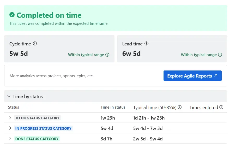
The panel compares the current issue against completed items from the same Jira space, the same issue type, and a recent historical window. For base-level issue types, the benchmark uses the last 3 months; for epics and higher, it uses 6 months. The health state then makes the result scannable: on track, needs attention, or at risk.
The important part is that the signal changes with the issue state.
For To Do work, the panel focuses on time in current status and lead time, which helps teams catch backlog items that have been waiting too long. For In Progress work, the Work item health panel can include WIP age, so the team can spot active items that are moving slower than expected. For Done work, it shifts toward cycle time and lead time so the same issue can be used in a retrospective.
This keeps the standup conversation concrete. Instead of asking whether a ticket "feels old," the team can ask whether it is outside the typical range for similar completed work.
What status transition history adds
Health tells you whether to pay attention. Status transition history helps explain why.

The Status transition history tab appears in the Activity section of the Jira issue. It shows every status change as a separate row: from status, to status, when it happened, who made the move, and how long the issue stayed in the previous status.
That separate-row behavior matters. If an issue visits Testing twice, the table does not flatten the visits into one vague total. Each visit remains visible. That makes rework, handoffs, and immediate returns easier to read.
For example, a ticket that spent 2 weeks in code review tells a different story than a ticket that moved between Testing and Ready for Test several times in one day. Both may produce a disappointing cycle time number. Only the transition timeline shows the shape of the delay.
When transition count is the better starting point
Sometimes you do not start with one issue. You start with a list.
The issue list in Agile Cycle Time Chart includes a Transition count column for chart-scope analysis. You can sort by it and hover over the value to see the statuses behind the count.
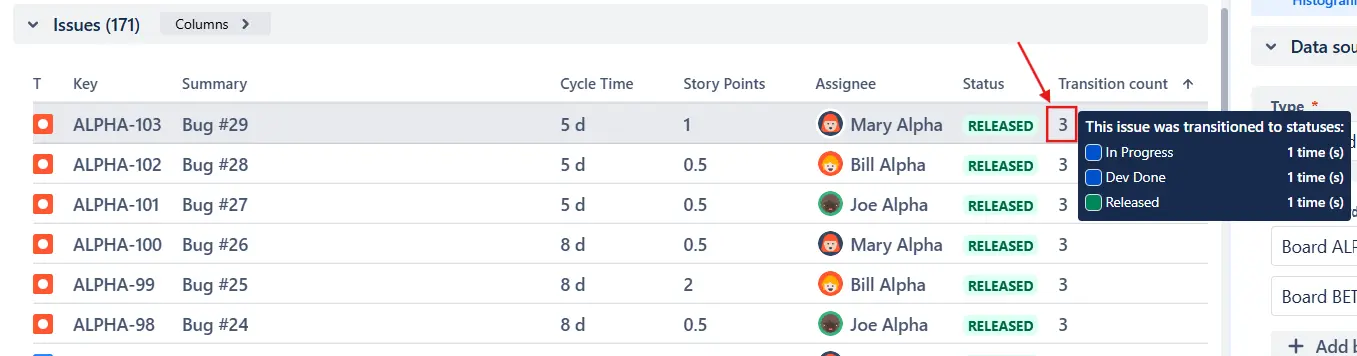
This is useful when the question is: "Which issues moved around the most?" The Transition count column helps identify candidates. The Status transition history tab then gives the single-issue drill-down.
That combination matters for retros. A team can start from the chart scope, find the issues with unusual movement, open one ticket, and read the exact timeline without copying changelog rows into a spreadsheet.
Examples to explore
If you want to see the broader chart workflow before installing anything, these interactive examples are the closest fit for this article:
- Time in Status report example - see how time accumulates across workflow statuses and where delays concentrate.
- Cycle time trend chart example - compare delivery timing over time and check whether one delayed issue is part of a larger trend.
- Cycle time histogram example - inspect completed-work distribution, percentiles, and outliers behind your normal delivery range.
Use these examples for the chart-level view; use Work item health and Status transition history when you need the single-issue explanation directly on a Jira ticket.
A practical playbook for Jira teams
Use the issue-level view for triage, and the chart-level view for patterns.
- Open the Jira issue your team is about to discuss.
- Check Work item health first. If it is on track, move on unless there is another reason to inspect it.
- If the issue needs attention or is at risk, look at the underlying metrics shown for its current state: time in current status, lead time, cycle time, or WIP age for in-progress issues.
- Open Status transition history when the timing needs explanation.
- Look for the workflow shape: one long wait, repeated back-and-forth, a handoff delay, or an immediate return from testing.
- When you need a broader retro list, sort the chart issue list by Transition count and drill into the outliers.
This keeps the conversation tied to evidence. A Scrum Master can ask about the specific stage that ran long. A delivery manager can separate normal variation from risk. A Jira admin can see whether a workflow or automation rule is creating unnecessary loops.
Where Agile Reports adds more
Agile Cycle Time Chart is the focused app for cycle time, lead time, status timing, issue health, and transition history. Its Work item health panel can also surface WIP age for in-progress issues. If your team wants this issue-level workflow as part of a wider Jira reporting suite, Agile Reports and Gadgets is the broader option.
Agile Reports and Gadgets includes the same Work item health and Status transition history functionality, so teams can inspect issue-level risk from Jira. But it also adds the surrounding reporting layer: velocity charts, cycle time charts, burnup and burndown charts, Monte Carlo forecasts, throughput charts, cumulative flow charts, WIP charts, created vs resolved charts, dashboard gadgets, reports, cross-team views, and multiple ways to move from a Jira issue into broader reporting.
That makes it a better fit when the question is bigger than one metric. A team may start with issue health, then need sprint performance, forecasting, scope change, WIP aging, throughput, or stakeholder-ready dashboard views in the same reporting package.
The point is not another chart
The value of issue health and status history is not that Jira teams get more metrics.
The value is that the right metric appears where the decision happens. During standup, the team needs to know whether the ticket deserves attention. During retro, the team needs to know where the work actually went. During workflow improvement, the team needs to know whether delays are coming from waiting, rework, handoffs, or overloaded stages.
Jira already stores much of the evidence. Agile Cycle Time Chart makes that evidence readable at the issue level, while Agile Reports and Gadgets app keeps the same path available for teams using the broader reporting bundle.




.png)